Spice up things with Rich Text 🌶️
Add a RichText component
Let's have fun with some text formatting, importing and rendering the RichText component from ReactBricks (and setting a default value for the new "description" prop):
// Thumbnail.tsximport React from 'react'import { types, Text, RichText } from 'react-bricks'const Thumbnail: types.Brick = () => {return (<div className="p-6 text-center"><TextpropName="title"renderBlock={({ children }) => <h1 className="text-2xl font-bold">{children}</h1>}placeholder="Type a title..."/><RichTextpropName="description"renderBlock={({ children }) => (<p className="text-lg text-gray-500">{children}</p>)}placeholder="Type a description"allowedFeatures={[types.RichTextFeatures.Bold,types.RichTextFeatures.Highlight,]}/></div>)}Thumbnail.schema = {name: 'thumbnail',label: 'Thumbnail',getDefaultProps: () => ({title: 'Hello, world!',description: 'Lorem ipsum dolor sit amet.',}),sideEditProps: [],}export default Thumbnail
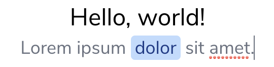
You see that now you are able to edit also a description text below the headline, and, if you select a part of this text, you can apply a Bold or Highlight style.
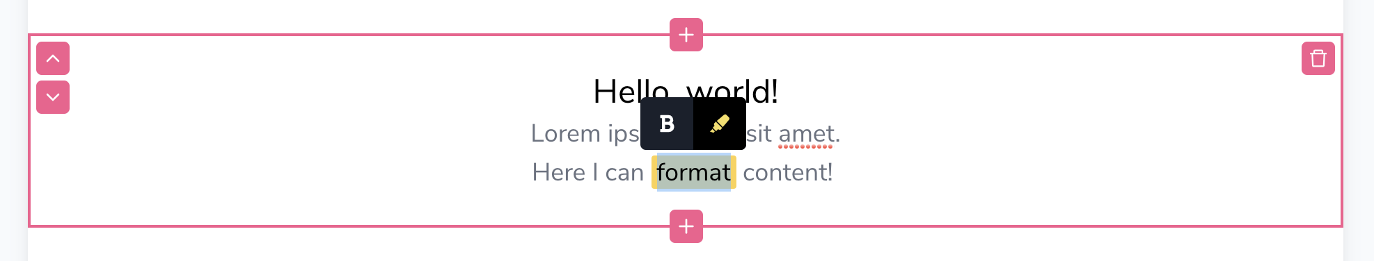
The RichText component has the allowedFeatures props where you can specify an array of allowed rich text features. Here we enabled just Bold and Highlight, but you could choose also Italic, Code, Link, OrderedList, UnorderedList.
Override the default formats
If we don't like the default yellow background for the highlight, we can change it, overriding the renderHighlight render function. The same is true for every rich text feature renderer:
<RichTextpropName="description"renderBlock={({ children }) => (<p className="text-lg text-gray-500">{children}</p>)}placeholder="Type a description"allowedFeatures={[types.RichTextFeatures.Bold,types.RichTextFeatures.Highlight,]}renderHighlight={({ children }) => (<span className="px-1 rounded bg-blue-200 text-blue-900">{children}</span>)}/>
And now our highlight text appear in this way: