Sidebar Props
Visual editing is great, but sometimes you have to change the behaviour of a component using external controls (for example, to choose a background color or the padding of a block).
The right sidebar is where users can change these kind of props, using the type of controls that you define in the schema's sideEditProps property.
Enough talking, let's see an example!
Simple sideEditProps
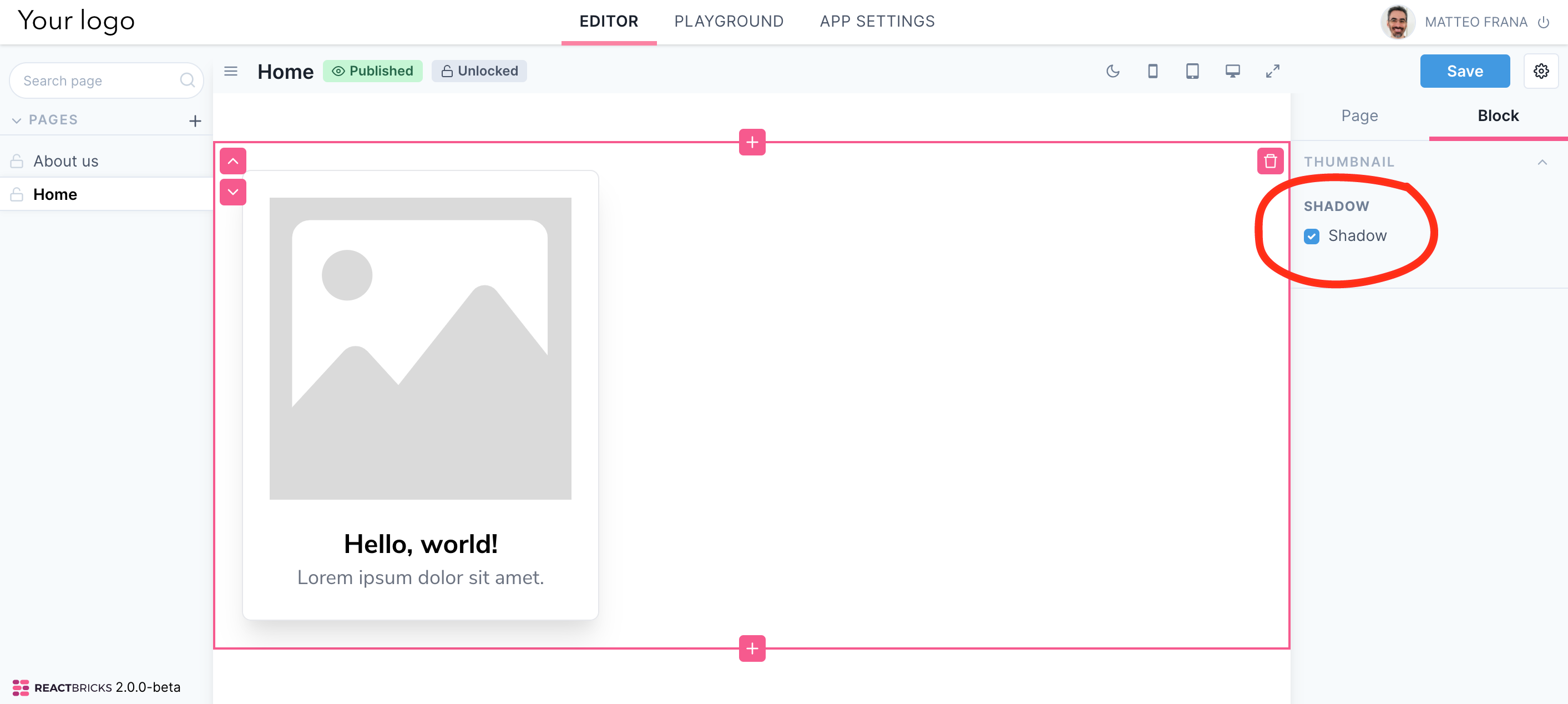
Let's make the thumbnail's shadow optional (active by default), using a hasShadow boolean prop which will show a checkbox control.
// Thumbnail.tsximport React from 'react'import { types, Text, RichText, Image } from 'react-bricks'interface ThumbnailProps {hasShadow: boolean}const Thumbnail: types.Brick<ThumbnailProps> = ({ hasShadow }) => {return (<divclassName={`my-6 mx-6 p-6 text-center w-1/3 border rounded-lg ${hasShadow ? 'shadow-xl' : ''}`}><ImagepropName="image"alt="Fallback alt tag"maxWidth={200}imageClassName="mb-6"/><TextpropName="title"renderBlock={({ children }) => (<h1 className="text-2xl font-bold">{children}</h1>)}placeholder="Type a title..."/><RichTextpropName="description"renderBlock={({ children }) => (<p className="text-lg text-gray-500">{children}</p>)}placeholder="Type a description"allowedFeatures={[types.RichTextFeatures.Bold,types.RichTextFeatures.Highlight,]}renderHighlight={({ children }) => (<span className="px-1 rounded bg-blue-200 text-blue-900">{children}</span>)}/></div>)}Thumbnail.schema = {name: 'thumbnail',label: 'Thumbnail',getDefaultProps: () => ({title: 'Hello, world!',description: 'Lorem ipsum dolor sit amet.',hasShadow: true}),sideEditProps: [{name: 'hasShadow',label: 'Shadow',type: types.SideEditPropType.Boolean,},],}export default Thumbnail
Now, if you add a Thumbnail block, you should see something like this:
Control types
React Bricks natively supports the following side edit props' types:
TEXTNUMBERDATERANGEBOOLEANSELECTIMAGECUSTOM
The Text, Number, Date and Range types render the expected HTML5 input control.
The Select type, based on the display property, can be rendered as a Select, a Radio button or a Color selection interface.
The Image type renders an image upload interface to manage properties such as the background image.
The Custom type lets you provide your own component to edit a sidebar prop (component property).
Work with color values 🎨
As you can see from the documentation, the Select type requires a selectOptions object with the display property and options with the array of available options. These options are objects which need a value (the value passed to your component) and label (shown in the select/radio).
When you use a color display for a select prop, the value should be an object with a required color property which must have a string value representing a color (hex, hsla, rgba...) so that React Bricks can display the correct color bullet for the color selection. You can put any other property you need to receive back on the value object (for example a class name to be used with Tailwind CSS).
Let's change the thumbnail's background using a sideEditProp:
// Thumbnail.tsximport React from 'react'import { types, Text, RichText, Image } from 'react-bricks'interface ThumbnailProps {hasShadow: booleanbgColor: types.IColor}const Thumbnail: types.Brick<ThumbnailProps> = ({ hasShadow, bgColor }) => {return (<divclassName={`my-6 mx-6 p-6 text-center w-1/3 border rounded-lg ${hasShadow ? 'shadow-xl' : ''} ${bgColor?.className}`}><ImagepropName="image"alt="Fallback alt tag"maxWidth={200}imageClassName="mb-6"/><TextpropName="title"renderBlock={({ children }) => (<h1 className="text-2xl font-bold">{children}</h1>)}placeholder="Type a title..."/><RichTextpropName="description"renderBlock={({ children }) => (<p className="text-lg text-gray-500">{children}</p>)}placeholder="Type a description"allowedFeatures={[types.RichTextFeatures.Bold,types.RichTextFeatures.Highlight,]}renderHighlight={({ children }) => (<span className="px-1 rounded bg-blue-200 text-blue-900">{children}</span>)}/></div>)}Thumbnail.schema = {name: 'thumbnail',label: 'Thumbnail',getDefaultProps: () => ({title: 'Hello, world!',description: 'Lorem ipsum dolor sit amet.',hasShadow: true,bgColor: { color: '#ffffff', className: 'bg-white' }}),sideEditProps: [{name: 'hasShadow',label: 'Shadow',type: types.SideEditPropType.Boolean,},{name: 'bgColor',label: 'Background',type: types.SideEditPropType.Select,selectOptions: {display: types.OptionsDisplay.Color,options: [{label: 'White',value: { color: '#ffffff', className: 'bg-white' },},{label: 'Light blue',value: { color: '#eff6ff', className: 'bg-blue-50' },},],},},],}export default Thumbnail
And the result is...
Great! Now you know how to let your users edit props via sidebar controls: well done! In the next lesson we'll see advanced sideEditProps usage (validation, conditional rendering of controls, collapsible groups and more).
Pay attention to the question below: it will give you many points!